Studio Note
A pattern is judged after it repeats.
Giyga Pattern Foundry is edited like a small surface laboratory, but its concern is not novelty for its own sake. It looks at the ordinary places where pattern becomes useful: a lining that should not distract, a label that needs memory, a screen background that must stay calm, a textile repeat that has to meet itself at the edge.
What the desk keeps
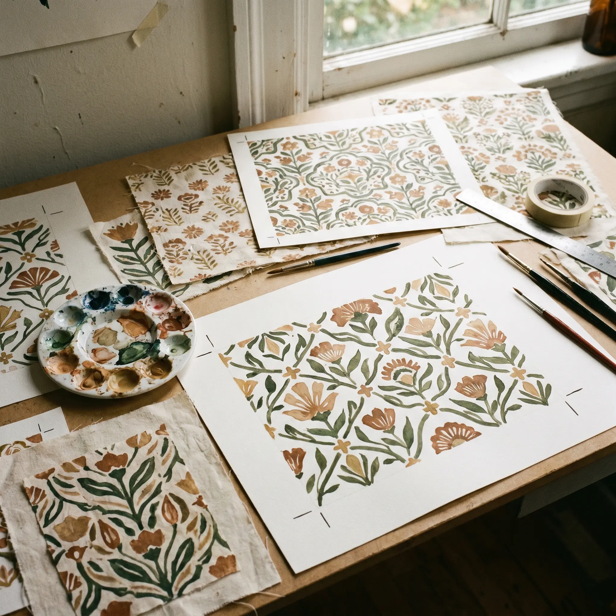
The site keeps notes on visual rhythm, motif families, color limits, registration habits, and edge behavior. A good repeat is not simply a beautiful tile. It is a tile with a memory of its neighbors. It knows where the eye should rest, how often an accent should appear, and which small irregularities make a surface human without making it careless.
Giyga is written for designers, editors, small studios, product teams, and curious readers who want language for surface decisions. Instead of treating pattern as a decorative afterthought, the foundry asks what the pattern is responsible for. Does it organize information? Does it soften a hard object? Does it create pace in a long view? Does it survive when cropped into a thumbnail?
The tone is deliberately exact. Essays favor named observations over vague taste: stripe pressure, field density, corner failure, secondary motif drift, contrast fatigue, and palette load. Those terms make a pattern easier to revise because they point to visible behavior rather than mood alone.